
VILLA blog design decisions
Jennifer Lee Palandro
Typography
The typography was a big back and forth between my original design and the final product. I’m aware character count for readability should be between 50-60 characters.
My original design showed about 65-70 characters per line.

We ended up with about 80-90 characters per line.

This was a major improvement over the originally desired typography standards, which would’ve resulted in about 120 characters per line.
Photography vs. text
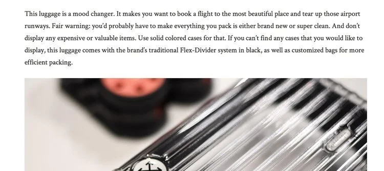
The thinking behind the wide photos versus the narrow text blocks stems from the fact that VILLA is a highly-visual e-commerce-driven brand. VILLA employs several talented photographers whose jobs are to capture product and lifestyle shots in order to help sell products online.
Because of the desired character-per-line discussion for the blog, the stakeholders and I went back and forth on having the photos be as wide as the text on desktop (which resulted in photos that were too small to be appreciated) or having the text be too wide, which degraded the readability experience.
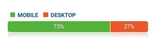
Most of the users who visit the VILLA blog are on mobile, according to Google Analytics.
So ultimately, the disparity between the width of the photos and the width of the text would only affect a small number of users.
A mobile-first approach
While I personally believe in a mobile-first approach most of the time now, the numbers for VILLA strongly lean towards designing for customers on mobile devices.
The goal of the blog is to sell products. According to Google Analytics, about 66% of the purchases are completed on mobile.
This is much higher than the average in 2016 where 34% of purchases in e-commerce, in general, were performed on mobile.
Because of this staggering number of mobile users for both the blog and the e-commerce site, the design was created with mobile users first.
Screenshots from the original design are below.


Icons
VILLA in general leans towards using SVG instead of PNG image formats. This is for several reasons because of file size and download speed, scalability, and the crispness on mobile devices.
Since we already determined most of the users are on mobile, and most modern devices have a higher pixel density (Retina or otherwise), this is yet another reason to use SVG instead of another image format.
We used SVG icons for the various blog categories in the design.
Not only are these featured on the homepage in desktop resolution…

…the icons are also used on individual blog posts to help signify the category at a quick glance.

Accessibility
After attending Mikey Ilagan’s course via Girl Develop It Philly on Accessibility, I made the case for pushing CSS- and JS- controlled text formatting for all-caps words and phrases.
There are a surprising amount of words that are capitalized on the VILLA blog (with VILLA being one of the specific offenders).
After learning that all-caps words are read as individual letters (“V-I-L-L-A” as opposed to “Villa”), I approached the other developer on the team to inject JavaScript that would automatically switch certain words to all-caps.
This is seen specifically on the Meet the Team page where the name of the blog (The Movement) is in all-caps, but it’s controlled by a JS-injected span that styles the text as uppercase in CSS.
