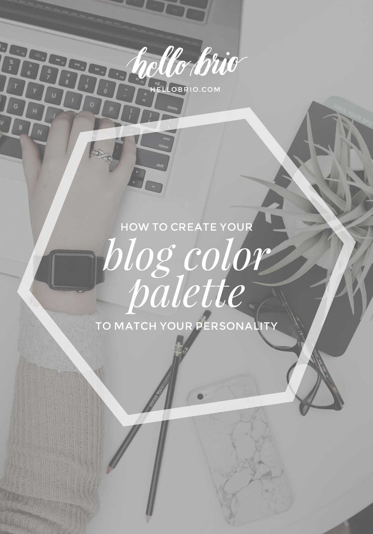
How to Choose a Branding Palette To Match Your Personal Style
Color palettes are extremely important for the visual branding of your website. It can immediately convey the mood of your site as well as hint at your target audience. A color palette can set you apart or cause you to blend in.
In this post, I'll share tips on how to choose a color palette for your blog that matches your personality.
As a super-relevant example, I'll explore the reasons behind my own recent blog-recolor choices!
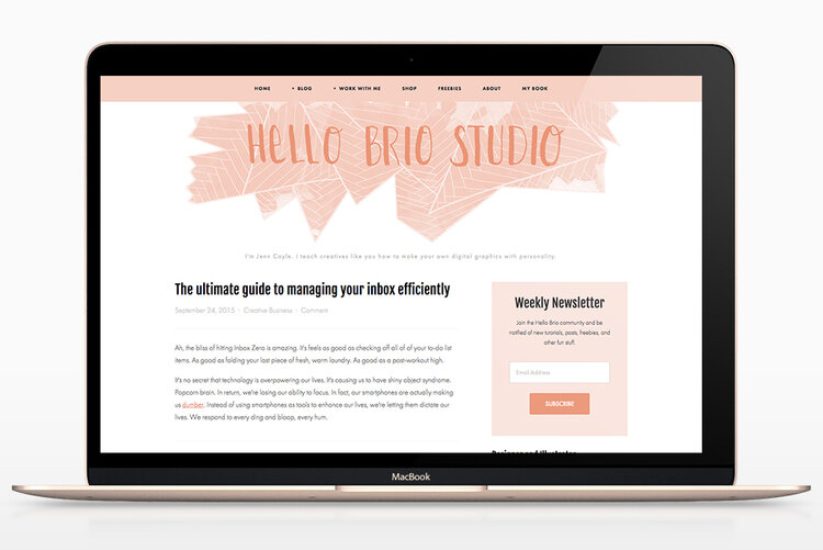
Before I re-designed my blog, my blog colors were mostly peachy-pink. Pastel. Gentle. It wasn't me AT ALL. The graphic elements fit my style, but the colorization of them is completely off. Plus, I felt like I blend in too much with similar blogs.

Not to mention, my blog title graphics were ALL over the place in terms of style and color:
There are a couple of things I ask design clients to do when I'm helping them choose colors. It comes down to clothes, decor, and Pinterest boards. Try this with me.
Look in your closet
Take a peek at your closet. What do you see a lot of? Do you have a sea of jewel tones? Neutrals? Black and white with pops of color? How do you usually pair your colors?
Feeling overwhelmed by your closet? Narrow it down a bit. If you were to pack for a trip, what would the inside of your suitcase look like?
If your closet isn't up to your ideals, take a look at a Pinterest style board you may have. Look for commonalities with colors, textures, or moods.

My closet is full of black, white and grey, with a couple of pops of color: nantucket red, yellow, light blue (not pictured), and hunter green (not pictured) all accented by camel colored leather and gold jewelry. That's it! No pink anywhere. You can start to see why I need to re-color my blog.
Look at your decor
Look at your bedroom or living room. Do you go for dramatic deep colors? Or do you have a neutral palette with fun accents? Is your taste monochromatic or full of complementary colors?
My decor taste is perfectly emulated in my studio apartment and my office.

The colors in my decor aren't far off from the colors in my closet. There are mostly neutrals and greys and some splashes of navy. Plants are really important to me, so I made sure to capture them here, too!
Look at your favorite Pins

Matilda poster by Andrew Bannecker
If all else fails, take a look at colorful Pinterest pins you like. I have a few favorites that always resurface for me, and the color schemes aren't surprising based off of my closet and decor palettes.
This Matilda poster by Andrew Bannecker strikes me the most. In fact, it's the main source of inspiration for my new color palette below.
I also love these pins, all sporting bright yellow.

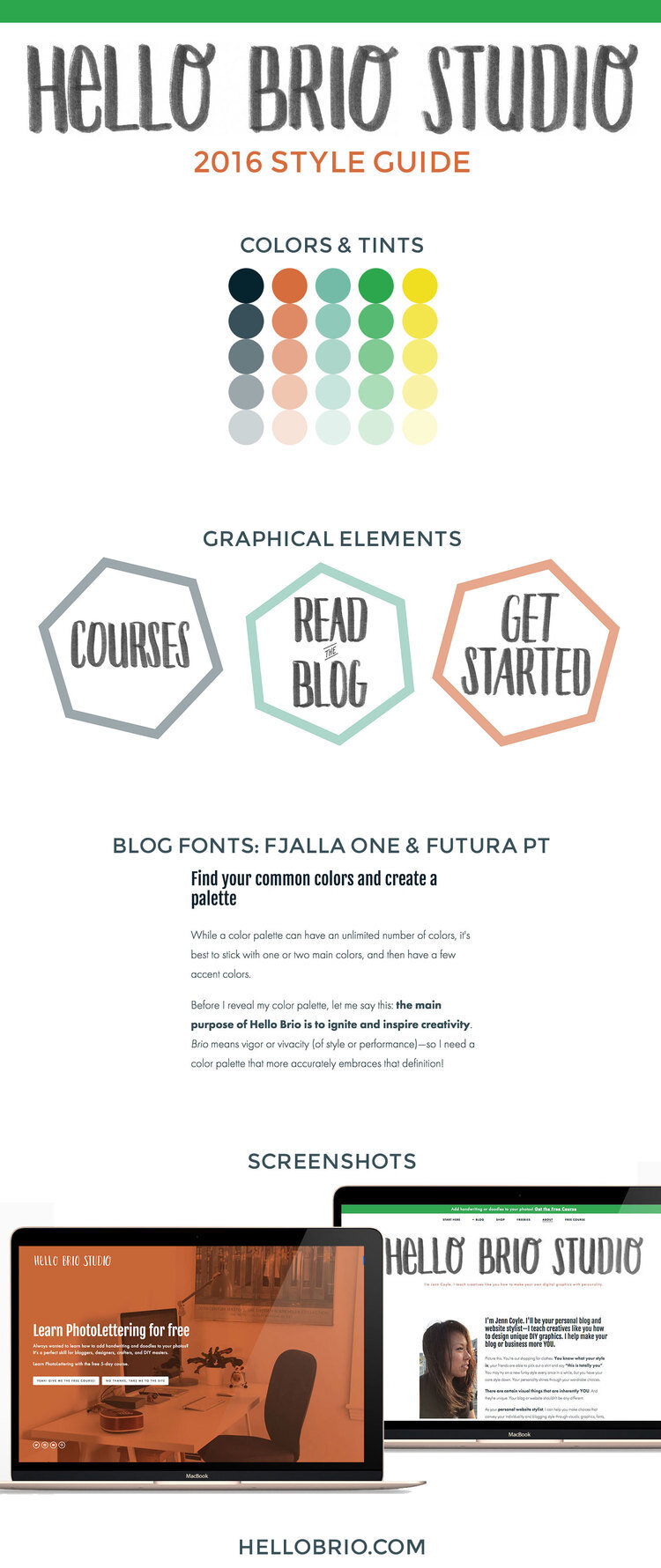
Find your common colors and create a palette
While a color palette can have an unlimited number of colors, it's best to stick with one or two main colors, and then have a few accent colors.
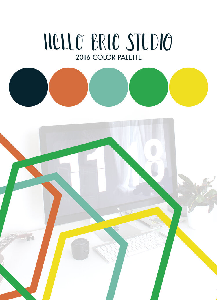
Before I reveal my color palette, let me say this: the main purpose of Hello Brio is to ignite and inspire creativity. Brio means vigor or vivacity (of style or performance)—so I need a color palette that more accurately embraces that definition!
From my explanation and exploration above, here's my new color palette!
How I applied my new color scheme
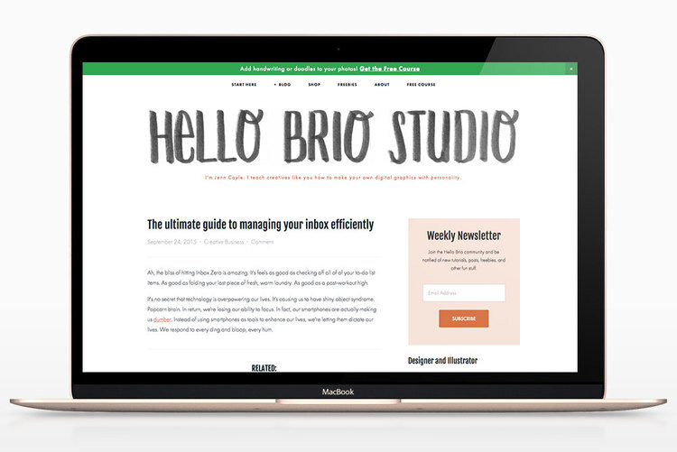
Woo hoo! I went through and recolored my blog according to my new color scheme. These colors feel much better to me, and I'm happy I made the switch.
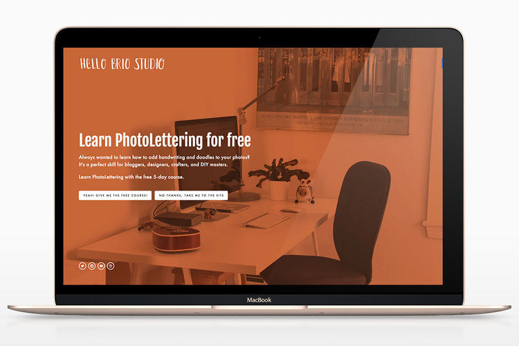
I ended up switching out the banner, too. While I liked the watercolor banner, it felt too girly still, so I went with something bolder.
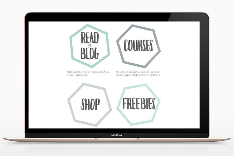
Here are new tiles for my Start Here page, with the same handwriting stuff going on.
Here's a good look at the before and after! The newsletter box looks similar but I assure you it's more orange than pink :)
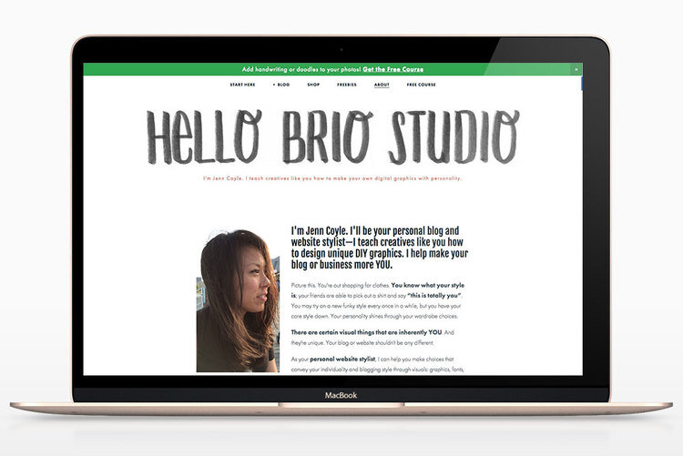
Here's the final style guide.
Your turn—let's talk about your color palettes!
How do you go about choosing a color palette? Do you feel like your color palette accurately emulates your personality or tone?
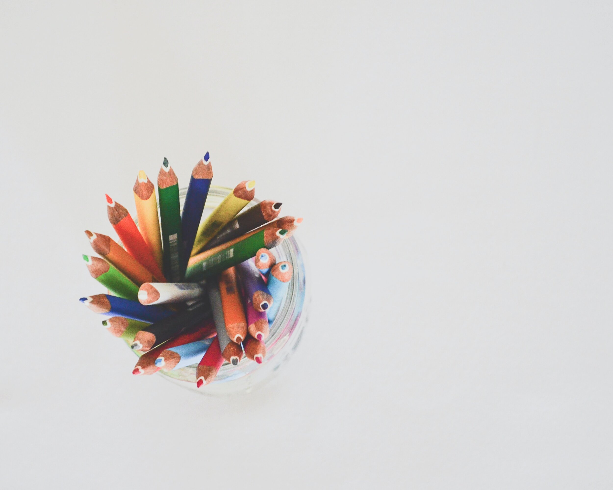
Cover photo by Corinne Kutz